CASE STUDY / ONBOARDING

Onboarding Redesign for Two Personas in a Single Interface

B2B No-Code Platform · Two personas · 3-phase flow · 54 → 90% completion · 6 months

Pluxbox onboarding flow across two personas

COMPANY

Pluxbox

DOMAIN

Media · Broadcast B2B · no-code

PERIOD

Mar 2026 — Sep 2026

TEAM

1 designer + Frontend + PM + QA + Support + Marketing

TYPE

Two-Persona UX · Progressive Disclosure

STATUS

In production, validated via controlled rollout

TL;DR

Onboarding as a 3-phase model

Pluxbox is a no-code B2B platform for media workflow automation, used by broadcast teams. Two types of users work side by side in the same interface: some build dashboards and layouts visually, others connect APIs and configure workflow automations. The old onboarding failed both — completion rate 54%, drop-off 40% in the early steps, support running manual demo calls for new clients.

I rebuilt onboarding as a 3-phase model: common start → role-based path by technical literacy → progressive disclosure with a micro-task and gamification elements. On a controlled rollout (treatment N≈25-40 external users + N≈10-15 internal), completion rose to ~90%, drop-off dropped to ~15%, and the volume of onboarding-related support tickets fell noticeably. Time-to-complete went up — but it was a deliberate trade-off, and that’s the core insight of this case.

RESULTS

What changed

COMPLETION RATE

~90%

up from 54% · treatment N≈25-40

EARLY-STEP DROP-OFF

~15%

down from 40%

Metric

Before

After

Onboarding completion rate

54%

~90%

Early-step drop-off

40%

~15%

Qualitative post-tour feedback

most participants rated positively

Support tickets on basics

baseline

noticeable drop

Time-to-complete

shorter

longer — deliberate trade-off

Treatment group N≈25-40. Directional signal, not statistically significant. See “On sample size” in source for full honest framing.

01 — CONTEXT

Two roles, one front door.

VISUAL (NON-TECHNICAL) ROLE

Builds on-air layouts, broadcast control dashboards, workspaces for shows. Works in a Figma-like paradigm, doesn’t write code. Decides by “I see it, I do it.” In the team this could be a producer, visual operator, or non-technical manager.

TECHNICAL ROLE

Connects ingest systems and MAM, configures workflow automations between services, works with logs and debugging. Decides by “I understand the architecture, I act.” In the team this could be an integration engineer, technical operator, or technical manager.

Two personas working in the same interface: visual operators and technical integrators

Both enter through the same front door — the product doesn’t split into two apps. Design it for one, and the other walks away.

PROBLEM

Before the redesign, onboarding was one-size-fits-all: a universal wizard with no awareness of user profile. Non-technical users saw too many technical terms in the first screens — “this isn’t for me,” close. Technical users saw shallow steps like “pick a template, change the color” — “this is a toy,” close.

Support regularly ran manual onboarding on request: 30–60 minute calls with new clients. Metrics confirmed it: first onboarding completion 54%, drop-off 40% in early steps, steady flow of support tickets on basics.

02 — MY ROLE

What I owned, what I shared.

LED

Discovery (support feedback, heuristic evaluation, user observation) · persona modeling around two user types · 3-phase onboarding architecture and flow design for both paths · full UX/UI for all screens, popups, and the interactive product tour · controlled rollout with a control group and usability testing

WITH THE TEAM

Phase prioritization with PM (Jira) · technical feasibility with frontend (trigger logic, hotspot tour, persistent help) · support feedback on real user pain · validation with marketing as proxy for the non-technical persona · usability tests with real users for qualitative signal

Onboarding flows, screens, popups and the interactive product tour

03 — PROCESS

Seven stages, validated on the way.

01

STEP

Discovery

Support feedback, heuristic evaluation, user observation, ticket and session analysis.

02

STEP

Two-persona model

Visual vs technical roles, with distinct mental models and decision drivers.

03

STEP

3-phase architecture

Common start → role-based divergence → progressive disclosure with micro-task.

04

STEP

Internal validation

Dev Team (technical proxy) + Marketing (visual proxy), N≈10-15.

05

STEP

Controlled rollout

External treatment group N≈25-40 with quantitative + qualitative signals.

06

STEP

Iteration

V1 popups → V2 redesign based on marketing feedback. Tested on subgroups.

07

STEP

Expansion

Roll the model out to advanced features and re-onboarding scenarios.

CORE BET

Common start + role-based divergence + progressive disclosure with a micro-task. Not two separate onboardings. Not one universal flow. Minimum shared steps until role actually matters, then contextual depth per persona.

04 — KEY DECISIONS

Seven calls that shaped the model.

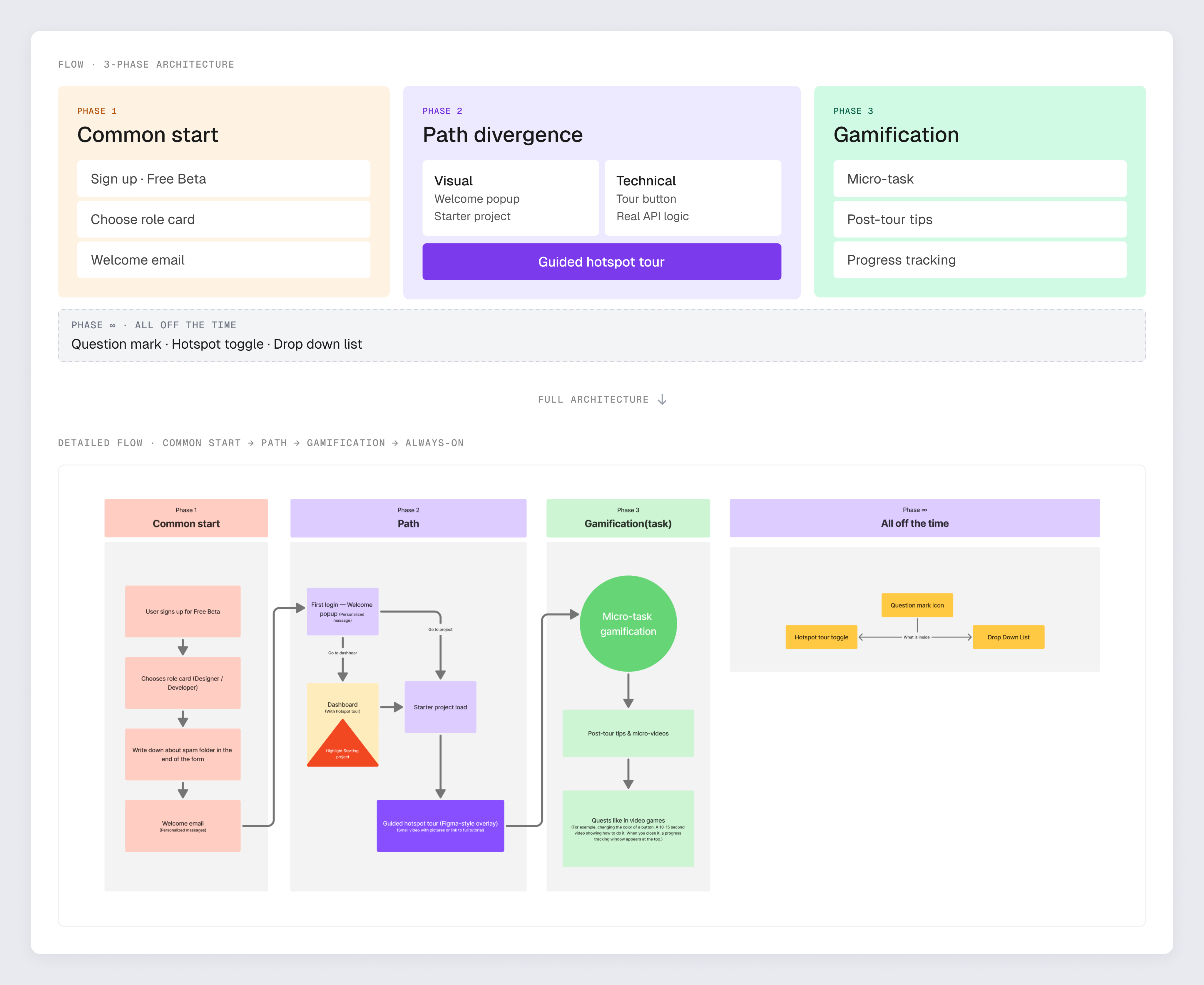
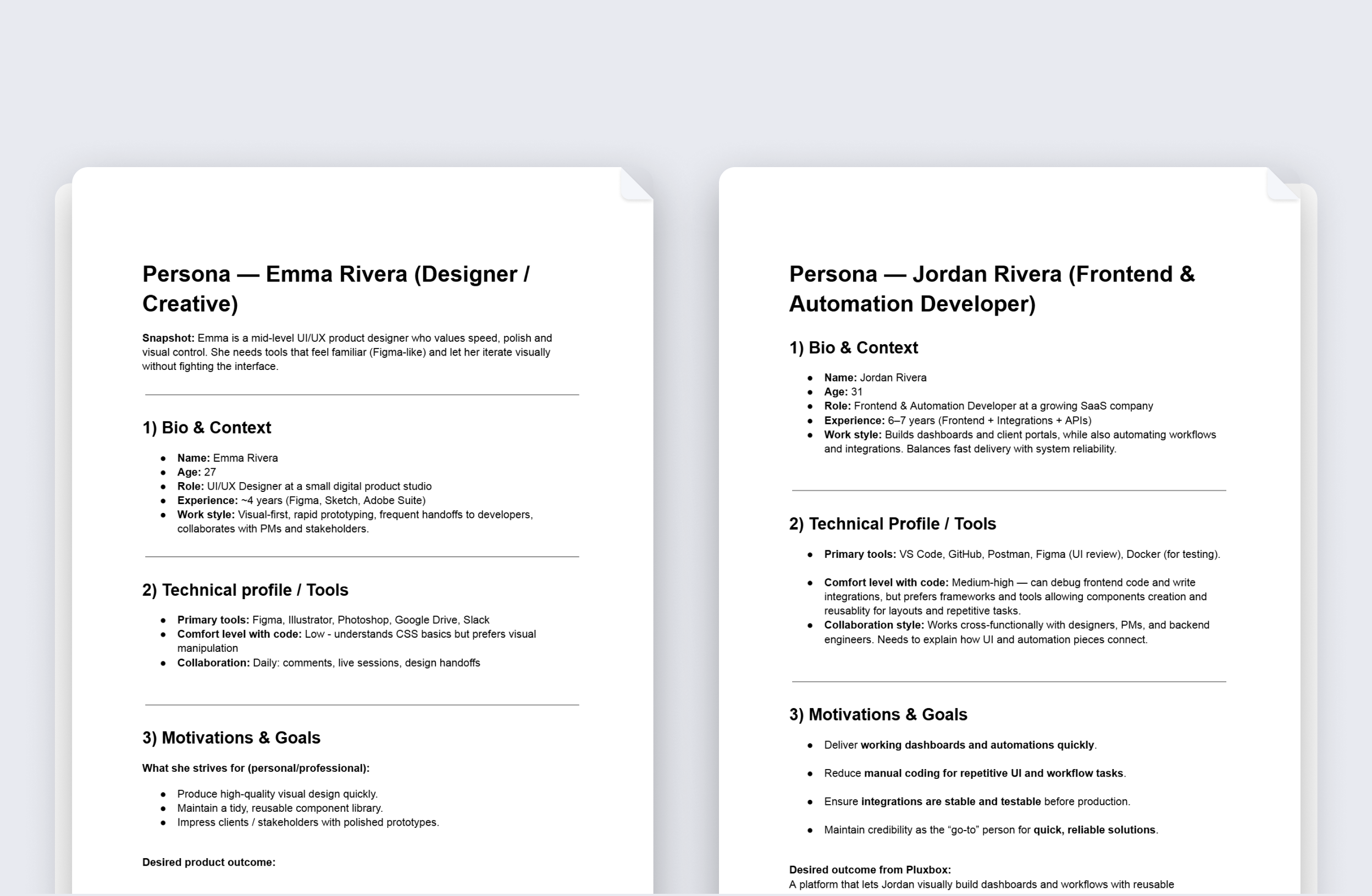
One interface, two paths: common start then role-based divergence Visual path: starter workspace, welcome popup, 4-step tour Technical path: opt-in tour, starter workflow with real API calls

04

DECISION

Popup redesign after marketing feedback

The dev team was judging by logic, marketing by visual feeling. For the non-technical persona, visual feeling IS the trust criterion. Ignoring marketing would have meant losing half the users.

Welcome popup redesign, V1 and V2 side by side

05

DECISION

Controlled rollout: control vs treatment + V1/V2 popups

Two-layer validation. Layer 1: old onboarding (control) vs new 3-phase (treatment). Layer 2: V1 popup (before marketing feedback) vs V2 popup, on separate subgroups. Signals from a controlled rollout — not proof at scale, but enough to justify expansion.

06

DECISION

Always-On help: support without coercion

Persistent help layer with three entry points: question-mark icon in the corner, hotspot tour toggle to restart, drop-down list with contextual help. All optional, nothing forced. Takes load off support without pressuring the user.

Always-On help: question-mark, hotspot toggle, drop-down list

07

DECISION

Time-to-value vs value-at-completion

The new onboarding takes longer than the old one — time-to-first-value formally got worse. PM agreement: onboarding success = the user reached the end and understood what they did. Completion + understanding beats minutes at the first-experience stage.

05 — ARTIFACTS

Created artifacts

01

3-phase architecture

Full flow: Common Start → Path A/B → Progressive challenge → Always-On

02

Persona cards

Visual and technical personas — bio, motivations, pain points, decision drivers

03

Visual path

Welcome popup, starter workspace, 4-step tour

04

Technical path

Triggered tour button, starter workflow with mock API, 5-step tour

05

Popup before/after

Welcome popup and practical task — V1 and V2, side-by-side

06

Always-On help

Question-mark, hotspot toggle, drop-down list

07

Rollout design + results

Control/treatment design, V1/V2 popups, key findings

06 — KEY INSIGHT

Speed through an interface ≠ good usability.

The old onboarding took fewer minutes because half the users weren’t actually going through it: they closed the window or clicked through without reading. Time-to-value said “everything’s fast”; completion and ticket flow said “everything’s broken.”

The new onboarding takes more minutes — but it actually does its job. The user reaches the end, understands what they did, and sees their first result with their own hands. That changes the quality of entry into the product: the user doesn’t come back to support asking “what is this thing anyway?”

Time-to-value is only useful in pair with completion and understanding. At the start of a product experience, depth matters more.

07 — REFLECTION

What I’d do differently.

01

Set up analytics before starting the work

The baseline of 54% completion and 40% drop-off had to be reconstructed from support tickets and partial metrics. If product analytics had been tuned to onboarding from the beginning, the before/after would have been tighter and more credible.

02

Design popups at the visual density of the main interface from version one

The marketing feedback (“notepad-like”) was predictable — the main interface was already polished, and popups were running on a separate track. If I’d held popup visual density to the main interface from V1, the V1→V2 iteration wouldn’t have been needed.

03

Bring the non-technical voice into design review earlier

The dev team validated the logic quickly; marketing feedback came later and reshaped the visual layer. If both voices had been in the room from version one, the cycle would have been shorter.

08 — WHAT’S NEXT

Where the model goes from here.

#01

Adaptive onboarding

Skip or deepen steps based on user behavior (experience with similar tools, tour speed, Always-On help usage). The current model is static by profile; the next layer is dynamic by behavior.

#02

Extending role-based logic to advanced features

The “common start + role-based divergence” pattern works beyond onboarding. Returning-user scenarios, new-feature introductions, infrequent tasks — all of them can reuse the same two-persona logic.

#03

Localization for client markets

Broadcast teams operate across countries with different languages and cultural specifics. Popup and tour content was designed in English — the next layer is adapting it for local markets.