

01
KEY DECISION
Map-first, not list-first
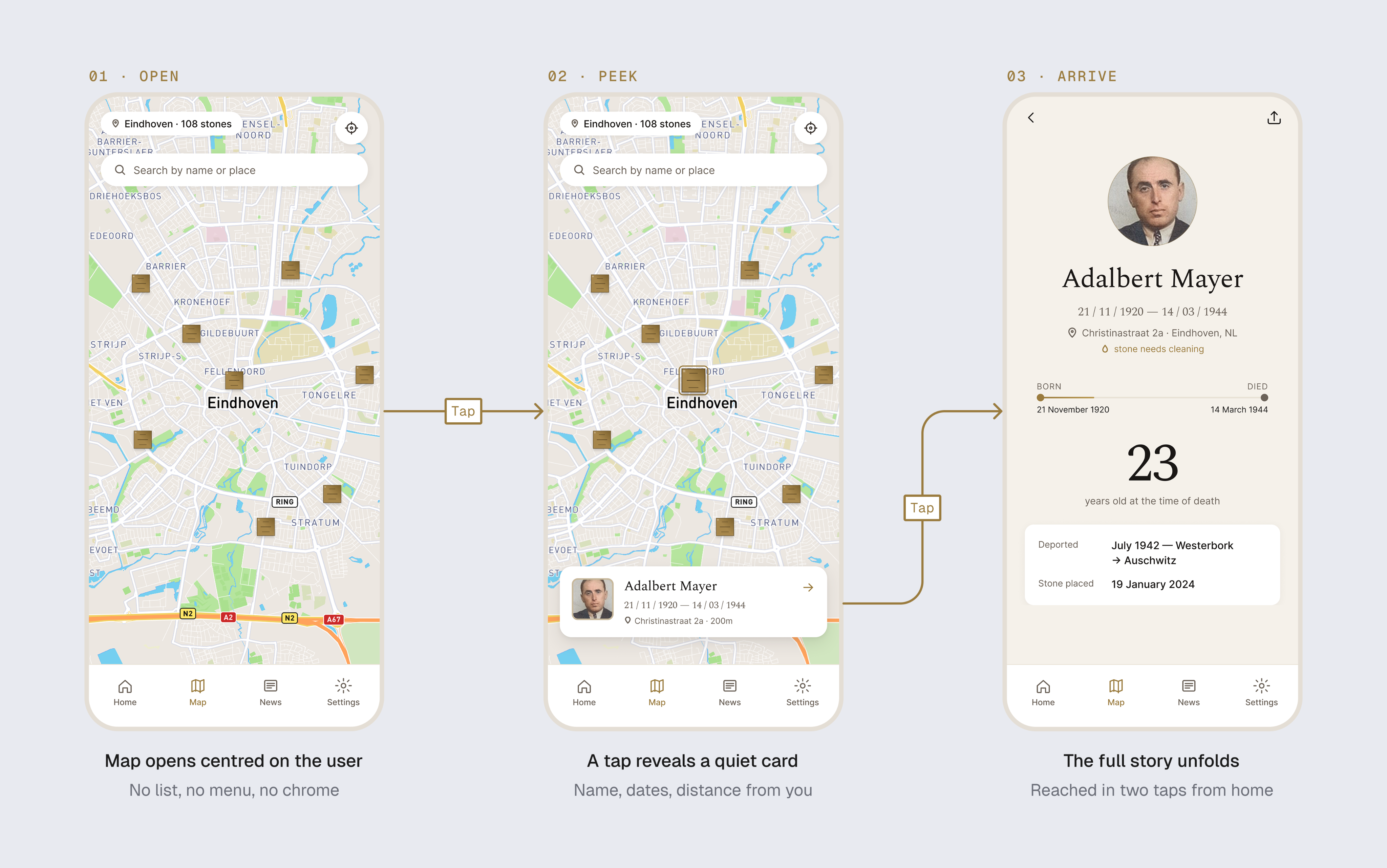
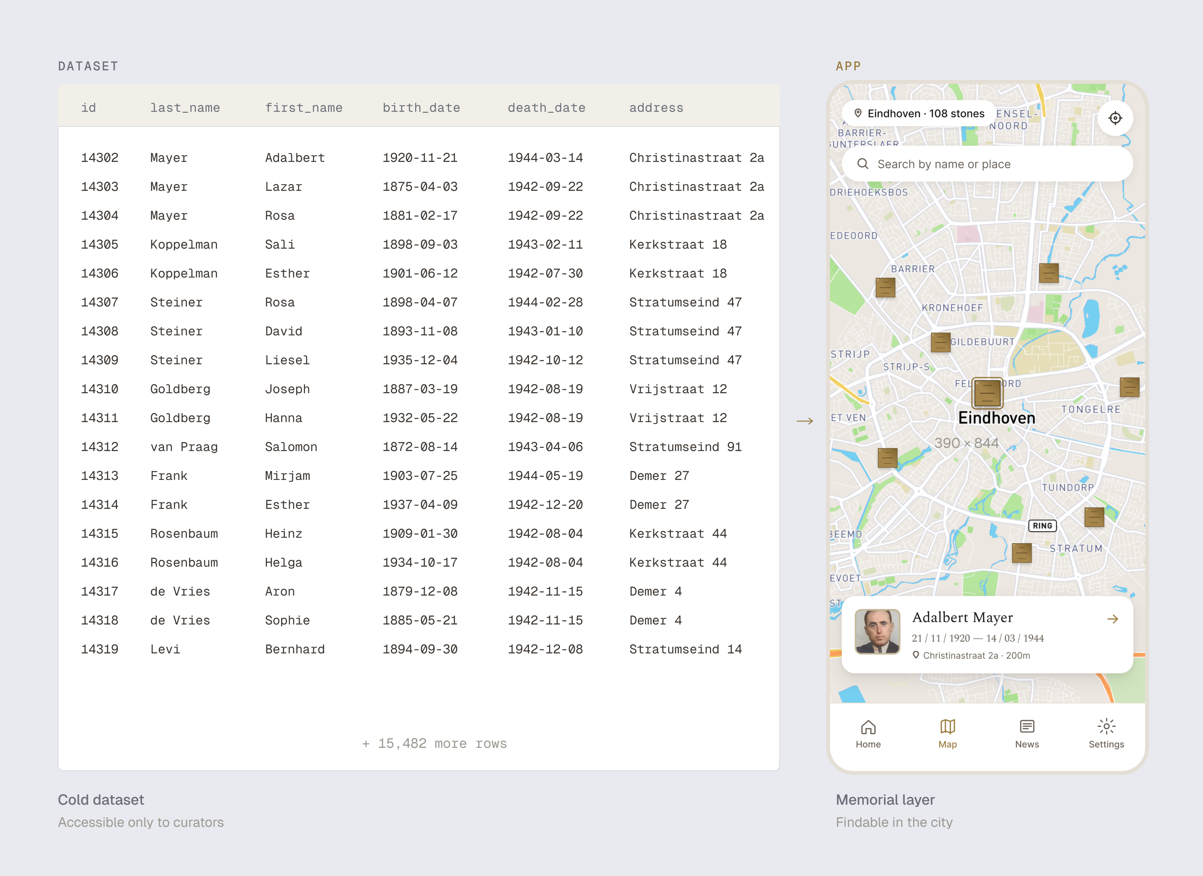
15,500 entries. A list view was the obvious choice — and the wrong one for an app used at physical sites.
Home opens on a map centred on the user, stones as understated brass pins: tap for a peek with name and dates, then the full profile. List view stays as a secondary path for users who already know the name.
Map answers the real question at a site — “whose home was this.” List-first framed the app as an archive; map-first frames it as a layer over the city. Map also solved scale: 15,500 names overwhelm any list but become navigable when filtered by location.