01
KEY DECISION
Two-tier tokens, named with dev before the first commit
Two problems would both compound at 100+ components — palette changes touching every file, and design and dev naming the same tokens differently.
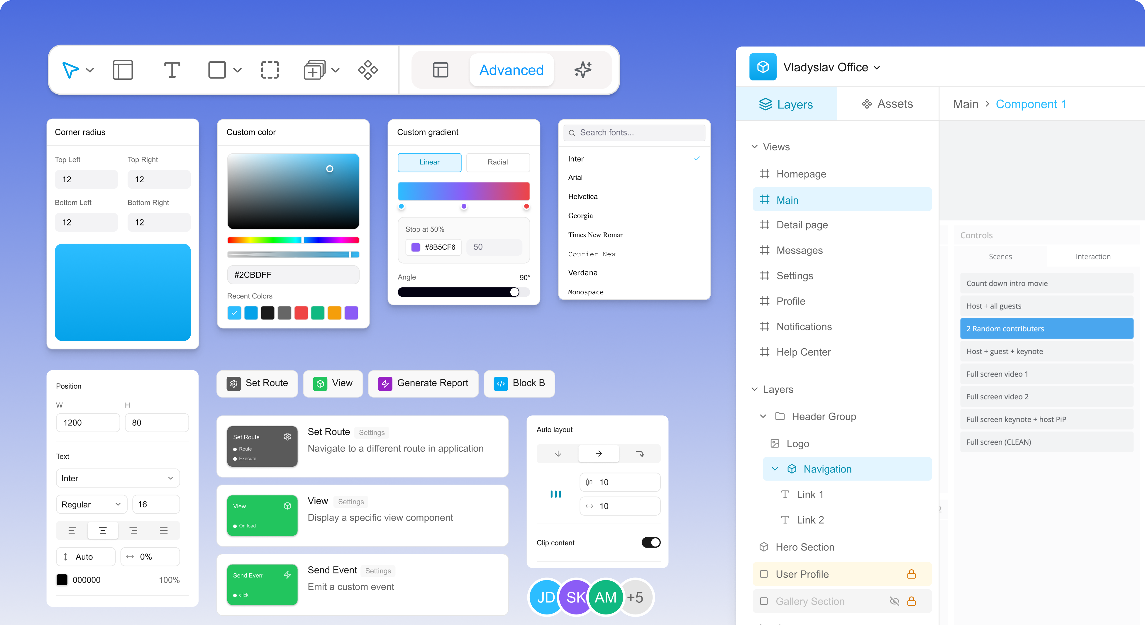
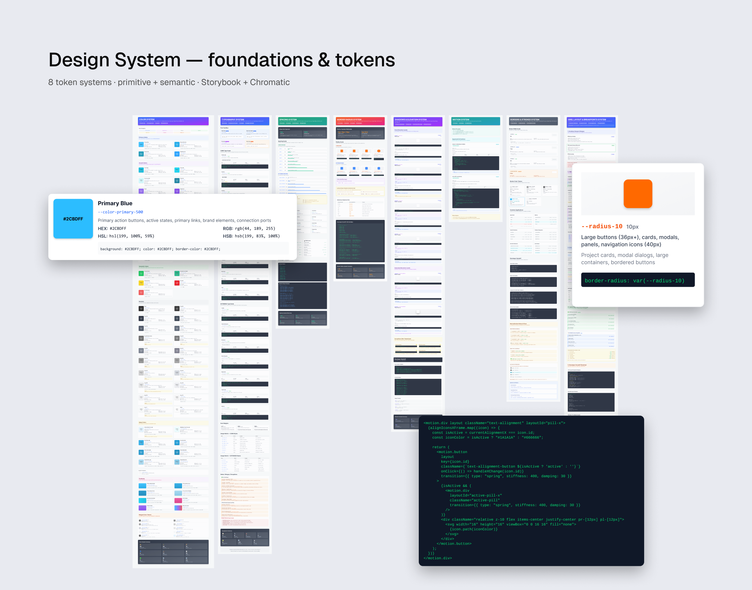
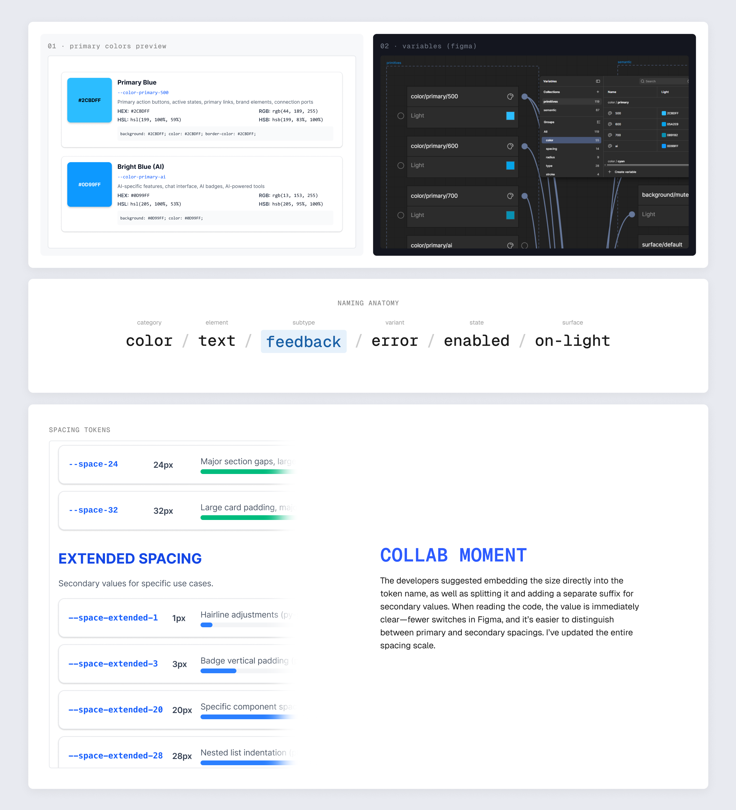
Without a semantic layer, every theme change or palette shift would propagate through every component file — maintenance debt by design. In parallel, design and code referenced the same tokens by different names; at 100+ components that drift would harden into code and become impossible to reconcile retroactively. The fix: a two-tier architecture — primitives hold the raw values; semantics reference primitives and carry intent (bg/canvas, text/inverse, accent/default); components consume semantics only. And before implementation began, one joint session with frontend locked a shared naming convention for every primitive and semantic token.
Components reference what a colour does, not its hex value — a cleaner contract with code, easier to maintain, and the foundation for dark mode and per-client themes without rework. And naming can’t be “agreed later”: conventions harden on first commit, so a 90-minute session up front replaced months of avoidable refactoring.